
Showing posts with label Chloe. Show all posts
Showing posts with label Chloe. Show all posts
Tuesday, 1 January 2013

Tuesday, 11 December 2012
Thursday, 29 November 2012
Representation of Artist through Digipak
 When it comes to designing the digipak as well as making sure it is appealing for the eye you must think about how you either want to continue the same representation of the artist that you portrayed in the music video(s) to ensure you appeal thoroughly to a niche market or whether you want to show them differently to give a variation of persona's to try and reach out to a wider, less specific market/audience.
Within ours we decided that carrying on from the music video would be the best idea as this will be our artists debut album that we should be creating one solid, easily recognisable persona that their fan base could get to know well and relate to.
To be able to do this I watch the video and took a few key points from it that I thought, could then be translated into our digipak.
 The first was that throughout the video Scarlett is very playful and acts her age, not trying to be older like many young female artist do within their videos to try and achieve a sex appeal. I thought this would be echoed well with the doodles as doodling is very innocent and cute and something every teenage girl has done therefore giving something our audience to relate to.
The next point was how Scarlett is very girly throughout the video, and therefore the style of the doodles should echo this.

 The third and final point I took was that due to the use of the filters we used in the video all the shots have a neutral colour pallet with no bright or garish colours, so I thought to create a seamless link between the two (music video to digipak) this could be subtly used within the digipak so like mentioned in the 'Digipak Imagery Ideas' blog I was thinking that light mint greens, oranges and creams would be a good pallet to stick to.
Digipak Imagery Ideas
When thinking more into the ideas of what imagery will be actually put on and in the digipak I came up with a few,
 On the front panel will be a picture of Scarlett (our artist). This will be the main the focus as this is what the consumer will see first and therefore it must be the artist of the album so they know who's it is. However also on the front there will obviously be the name of the artist and the album name, as this will again alert the viewer of what it is they are looking.
In addition there will be some doodles, not too so it will distract the eye away from the artist but so the theme is then able to run throughout the rest of the digipak without making it confusing.
 On the inside panels although Scarlett will still be on all the panels (bar maybe the CD tray, which I haven't decided yet, as I'm thinking that on the actual CD facing there can be doodles so even that links in with the theme and have the background plain) the doodles will be prominent.
Finally on the back of the cover I will have a picture of Scarlett in a thinking pose and have the track titles in a thought bubble.
For the background of panels I was thinking they will all be the same. I thought it would look good if it replicated a teenagers notebook with the lines (like the image to the right) as this would again link with the teenage doodle theme.
When it came to the colour way as we are using intertextuality from the film 'Juno' I thought we could use light mint greens, oranges and creams in the same way they do in there posters.
 On the front panel will be a picture of Scarlett (our artist). This will be the main the focus as this is what the consumer will see first and therefore it must be the artist of the album so they know who's it is. However also on the front there will obviously be the name of the artist and the album name, as this will again alert the viewer of what it is they are looking.
In addition there will be some doodles, not too so it will distract the eye away from the artist but so the theme is then able to run throughout the rest of the digipak without making it confusing.
 On the inside panels although Scarlett will still be on all the panels (bar maybe the CD tray, which I haven't decided yet, as I'm thinking that on the actual CD facing there can be doodles so even that links in with the theme and have the background plain) the doodles will be prominent.
Finally on the back of the cover I will have a picture of Scarlett in a thinking pose and have the track titles in a thought bubble.
For the background of panels I was thinking they will all be the same. I thought it would look good if it replicated a teenagers notebook with the lines (like the image to the right) as this would again link with the teenage doodle theme.
When it came to the colour way as we are using intertextuality from the film 'Juno' I thought we could use light mint greens, oranges and creams in the same way they do in there posters.
Digipak Theme
After looking at a selection of digipaks I decided that the most successful ones had a theme that ran throughout and therefore this is what e would have to include within ours.
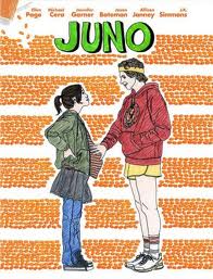


What I came up with was the idea of teenage doodling. This was because this is a fun idea that links well with the conventions of our genre (Indie-Pop) as the girly doodles will link with the pop conventions and the neutral colours of the paper.
Once we had the theme I then tried to find some examples and although I couldn't find any didgipaks I did find a film poster from the release of 'Juno'.
Also this film is a typical indie film, helping us relate back to our genre and would allow us to use intertextual references.
Tuesday, 27 November 2012
Digipak Planning
We have searched our photographs and footage in order to find a suitable picture to use for our digipak. However, all the photos we have taken during our shoot are not of a high enough standard for our digipak. Therefore, we have decided in order to achieve the best results, we will do a photoshoot in college on Wednesday 28th.
In the mean time, we will experiment with what background we are going to use. We have decided to use a bright coloured background to suit the album title "Fluorescent Love", the genre and the style of the artist.
In the mean time, we will experiment with what background we are going to use. We have decided to use a bright coloured background to suit the album title "Fluorescent Love", the genre and the style of the artist.
Friday, 23 November 2012
Album names
To be able to find a theme for our digipak we first had to get a name.
We came up with a list of names and then asked the people in our class to see which was the most popular;
- Fluorescent Love
- With Love
- Love Drunk
- Frantic Love
Although all of them got a few votes the one with the most was 'Fluorescent Love'
The obvious theme for this name would be the colour way that would run throughout and the editing we will use.
Friday, 16 November 2012
Pairing Fonts
Like mentioned previously in a blog, I have found that fonts working well together or picking the right font for our artist is crucial for the success of our digipak.
To ensure I achieve this I have done some research on the internet and for a website that gives you key tips and rules when it comes to pairing fonts.
The first heading was about how many fonts you should use within a page, or in our case a digipak panel. There was no conclusive answer but said that no matter how many you chose they should ALL work well together. In the page they used a particular way of explaining this which although was pretty quirky really explained the importance. They talked about how each font was a personality and when pairing them together you should think about the idea of seating arrangements at a wedding. One entertainer is usually enough as too many strong personalities can make the atmosphere overpowering and usually ends up in tears, like an episode of Big Brother.
However make sure there is some charisma in the group as eight people with very little to say quickly becomes awkward and results in a toe-curling wait for speeches..
They then go onto say that although there are no rules it is far more challenging to have more fonts so finding one that has a lot of alternatives and weights help considerably as you already know they are harmonious.
The next point was about whether or not to pay for fonts, however due to the fact that this is a student project I feel that paying would be unnecessary as within the site they showed the difference between a payed and free font and in my personal opinion I preferred the free so I think its all down to personal opinion and the actual font itself.
Something that was helpful is they gave a few names of sites that offer free fonts which will definitely help and something I will look at when it comes to choosing ours.
Once the introduction was over, the website then actually begun to explain exactly how to pair fonts and introduced us to three terms; concord, contrast and conflict saying that good pairing relies on concord or contrast but never conflict. This means that fonts can work well by sharing particular qualities or being completely different but can easily conflict for a number of reasons, being too a like is one of them.
 The first point they started to tell us about was concord (concordance) which is the idea that two fonts share similar traits. One way of achieving concordance between fonts is to pair two from the same family.
 With these two examples they share subtle characteristics such as the one on the right's proportions are the same in the 'o' and the 'e'. Also the one on the left all the lines within both fonts are really soft (this also works with harsher lines)
Contrast between fonts can also often lend a winning combination, but in what ways can fonts contrast? This is the list that the website then gave me;
 A classic way of pairing fonts is to use a decorative font with a no-nonsense style. To then be able to show which one is 'boss' use weight or size, for example in our case the title of the album could be in a fancy font bold with the name of the artist in a simpler one without using bold showing a clear dominance on the cover.
 (A tip they also dropped into this part of the site was saying that 'Condensed fonts always work well to get your attention, as they take up a lot of vertical real estate' This is something we should definitely take into consideration when making our cover as this is the panel that will have to catch peoples eye. An example shown on the left)

To ensure I achieve this I have done some research on the internet and for a website that gives you key tips and rules when it comes to pairing fonts.
The first heading was about how many fonts you should use within a page, or in our case a digipak panel. There was no conclusive answer but said that no matter how many you chose they should ALL work well together. In the page they used a particular way of explaining this which although was pretty quirky really explained the importance. They talked about how each font was a personality and when pairing them together you should think about the idea of seating arrangements at a wedding. One entertainer is usually enough as too many strong personalities can make the atmosphere overpowering and usually ends up in tears, like an episode of Big Brother.
However make sure there is some charisma in the group as eight people with very little to say quickly becomes awkward and results in a toe-curling wait for speeches..
They then go onto say that although there are no rules it is far more challenging to have more fonts so finding one that has a lot of alternatives and weights help considerably as you already know they are harmonious.
The next point was about whether or not to pay for fonts, however due to the fact that this is a student project I feel that paying would be unnecessary as within the site they showed the difference between a payed and free font and in my personal opinion I preferred the free so I think its all down to personal opinion and the actual font itself.
Something that was helpful is they gave a few names of sites that offer free fonts which will definitely help and something I will look at when it comes to choosing ours.
Once the introduction was over, the website then actually begun to explain exactly how to pair fonts and introduced us to three terms; concord, contrast and conflict saying that good pairing relies on concord or contrast but never conflict. This means that fonts can work well by sharing particular qualities or being completely different but can easily conflict for a number of reasons, being too a like is one of them.
 The first point they started to tell us about was concord (concordance) which is the idea that two fonts share similar traits. One way of achieving concordance between fonts is to pair two from the same family.
 With these two examples they share subtle characteristics such as the one on the right's proportions are the same in the 'o' and the 'e'. Also the one on the left all the lines within both fonts are really soft (this also works with harsher lines)
Contrast between fonts can also often lend a winning combination, but in what ways can fonts contrast? This is the list that the website then gave me;
- Style
- Size
- Form
- Weight
- Colour

 A classic way of pairing fonts is to use a decorative font with a no-nonsense style. To then be able to show which one is 'boss' use weight or size, for example in our case the title of the album could be in a fancy font bold with the name of the artist in a simpler one without using bold showing a clear dominance on the cover.
 (A tip they also dropped into this part of the site was saying that 'Condensed fonts always work well to get your attention, as they take up a lot of vertical real estate' This is something we should definitely take into consideration when making our cover as this is the panel that will have to catch peoples eye. An example shown on the left)
Finally they gave us brief look-in to what conflicts with examples of fonts that are too similar and some that are too different.
The one on the right's proportions are all wrong the letterings x-heights were far too different with the top font being a lot longer. Yet they share weight and size, and both share those odd spurs on the end of each character.
Therein lies the problem. By sharing those last three details (weight, size and decoration) they’ve become too alike. They’re performing very similar roles, but the small differences are conflicting which makes for an awkward overall effect.
They finalized by saying that pairing fonts can not be put down to facts and figures its all tips and conventions and what you personally like and don't, but find out why you don't like it or why its not working and this will allow you to make decisions quicker.
The link for the website is below and has far more examples but the ones above were what I thought showed the points the best.
http://webdesign.tutsplus.com/articles/typography-articles/a-beginners-guide-to-pairing-fonts/
Wednesday, 14 November 2012
What you expect to see within a Digipak.
To help make our digipak look professional I was looking at what the conventions are for a digipak layout, for example what people expect to see on the cover, inside left and back.

I wrote out what I found onto a template so we had a visual example.
Most of the panels in the digipaks are driven by there function meaning that the design elements don't have to be that strong however two of them don't seem to have any use and are simply there for aesthetic appeal meaning that when we come to design our these will take more planning.
What are Digipaks?
Digipaks typically consist of a gatefold (book-style) paperboard or card outer binding, with one or more plastic trays capable of holding CDs or DVDs.
Since digipaks are among the only alternatives to jewel cases to be used for major record companies the term is used generically even when the media holder is a hub or soft spot rather than a full plastic tray. Digipaks are a lot let resistant to abrasion than jewel cases and therefore show signs of wear relatively quickly. Due to this manufactures recommend coating the raw printed paper with a UV coating thus ensuring greater longevity.
This style of packaging often used for CD singles or special editions of CD albums.

Since digipaks are among the only alternatives to jewel cases to be used for major record companies the term is used generically even when the media holder is a hub or soft spot rather than a full plastic tray. Digipaks are a lot let resistant to abrasion than jewel cases and therefore show signs of wear relatively quickly. Due to this manufactures recommend coating the raw printed paper with a UV coating thus ensuring greater longevity.
This style of packaging often used for CD singles or special editions of CD albums.

This is a standard digipak.
Tuesday, 13 November 2012
Successful Student Digipaks
Due to the fact that digipaks are starting to get rarer and rarer, when looking for some that fit within our genre type it was virtually impossible. So instead I looked for student examples that I thought were successful and access why I thought this. This would therefore help me when it came to creating our own as I would be able to take the points that I found and then apply them.
The reason I think this is so appealing is the way there is a theme running throughout and the fact that she has clearly thought about how it will all link together. It is also the colours she uses as they and very soft and gentle enticing the typical 'girly girl' (which i am assuming is her target audience).
Despite it being successful the way it has actually been constructed is not that complicated as it is just the fact she has both good photography and editing skills therefore making one simple image far more appealing.
The second is very similar to the one above, as it too has a theme that occurs throughout.
With this digipak I was particularly drawn to the filters as this is something we have been drawn to throughout the whole of the project and have tried to incorporate into the video so if we were to this in the digipak it would be a clear link and thus build the iconography of the artist.
Also, like the one before, the photography used is of very high quality immediately making it look far more professional, so I think this will be essential when it comes to creating ours.
The third is not as good as the two before but there were elements within that I thought are relevant to our genre and the way we what to 'promote' our artist.
Unlike the other two digipaks this one focuses a lot more on the branding of the artist which is something we will do in ours. For example from just one look you can see that the artists music will be very organic and due to the styling of the artist it will most like be pop.
The final is the most basis and most likely got the least marks as it has simply used images from the internet and have layered writing on. In addition the ratio of the images is all off as in the bottom left she is far skinnier then in the top right showing clearly they weren't even capable of finding images that fit.
Also from looking at numerous pages of digipaks on google images I have seen the importance of good use of fonts proving that if the font is wrong it can potentially ruin the digipak. I think this one uses font well and especially with the use of the white backing as this emphasizes what has been written.
Overall what I have learnt from looking at the digipaks is that good photography and editing is essential, but not to over edit as this will distract the viewer from the artist and as this will be our debut artist branding is one of the most important things and we need to be able to create a clear persona for the audience to engage with.
Another thing is that we should take as much care with the font as we should the images as if this does not link with theme it will throw the audience off balance and put them off the digipak and potentially the artist.
Friday, 9 November 2012
Filters
Within the lesson on wednesday whilst the others were out doing the re-shoot we decided to start looking and exploring the different filters and playing with the colours to then be able to see which would best suit our video.
After many different attempts we finally came up with one we were happy with.
This is the steps we took;

This was the initial 'try-out' and we both agreed it was far too dull and green.

It was a similar story with this one as it looked really artificial and far too purple.

In this shot we started to see that the red and oranges were better but this still looked too obvious so we then looked more into the actual filters rather than just looking just at what colours should be more prominent.

Although the lighting on his one was better we thought it was too crisp and throughout the planning we have repeatedly said that we want more of a vintage look as this fits better with the genre.

This was the final outcome that we were able to do within the lesson and although it is a bit faint it is a far better foundation to work from than what we had at the start.
Also, it is definitely some thing we could come back to tweak at the end once we know for certain what the vibe of our video is, as due to the new footage it may be heading in a different direction with the use of the slow motion and the spot focus.
Tuesday, 6 November 2012
Studying the Audience
Studying the Audience on Prezi
On this Prezi presentation I looked at the theories of how people watch music videos and therefore showing us how we would be able to entice as many people as possible to watch our video and keep them engaged.
On this Prezi presentation I looked at the theories of how people watch music videos and therefore showing us how we would be able to entice as many people as possible to watch our video and keep them engaged.
Wednesday, 24 October 2012
Our Ideal Audience
At the heart of every music video is the idea of promotion, to be able to reach out to the audience and promote the artist or band and therefore sell tracks and albums. However to be able to do this you must be able to relate to the audience and showcase the artist in a way that appeals to them.
To do this I have looked at the type of people that listen to Pop-Indie and this is what I came up with.
I looked at five categories that I thought would us help understand what we would have to put in our video or the way we need to construct the video in a way to best suit the needs of our audience.
The five categories were;
- Fashion- To see how we should dress the characters in the video
- Television- What kind of characteristics they look for in people they like to watch
- Interests- Whether we would be able to involve any in the video to be able to create a common ground and something they can relate to
- Make-up- What kind of make-up our characters should have, if any
- Social Points- What kind of locations we should shoot at

Friday, 19 October 2012
The Shoot Issues- Wednesday 17th
On Wednesday the 17th we did the shoot for our music video, during the course of the day we were faced with numerous issues and problems however in most cases we were able to find resolution.
Before we began the actual shoot we did a recce of our locations and took photos, this gave us an idea of the shots that we were going to be taking.
Like previously mentions we were faced with problems throughout the course of the day, the first one was the traffic. This was a huge issue in the morning with our main character within our video as she was an hour late putting the shooting behind schedule.
The second was the public walking in front of the camera and therefore ruining the shot. this meant that we were having to repeat the same shot far more than we had predicted, again putting us behind schedule.
Some other problems we didn't anticipate were issues in the camera, these were the memory card very quickly became full so had to wait for a second to be brought to us, although this was a good thing that we were clearly getting a lot of coverage, it once again wasted time.
Another thing was the battery went flat half way through the afternoon so we had to stop filming once again to charge it up in at a near by Starbucks. This could easily been avoided if we had taken another fully charged battery with us.
Another problem we had come across was the fact that we had to have costume changes throughout the shooting and the toilets that we were using were quite far away meaning this took up time traveling back and forth, for example at one location we were 15 minutes away from the nearest toilets.
Due to lack of initial research we forgot to look at wether or not the botanical gardens were free to get into and unfortunately they were not so that location was unavailable meaning we had to find alternatives.
Thankfully none of these problems affected our shooting too much and we were able to get all the footage we need to put together a rough cut and if we find though the course of editing that there is not enough we have already planned where we can go to get some more.
Before we began the actual shoot we did a recce of our locations and took photos, this gave us an idea of the shots that we were going to be taking.
Like previously mentions we were faced with problems throughout the course of the day, the first one was the traffic. This was a huge issue in the morning with our main character within our video as she was an hour late putting the shooting behind schedule.
The second was the public walking in front of the camera and therefore ruining the shot. this meant that we were having to repeat the same shot far more than we had predicted, again putting us behind schedule.
Some other problems we didn't anticipate were issues in the camera, these were the memory card very quickly became full so had to wait for a second to be brought to us, although this was a good thing that we were clearly getting a lot of coverage, it once again wasted time.
Another thing was the battery went flat half way through the afternoon so we had to stop filming once again to charge it up in at a near by Starbucks. This could easily been avoided if we had taken another fully charged battery with us.
Another problem we had come across was the fact that we had to have costume changes throughout the shooting and the toilets that we were using were quite far away meaning this took up time traveling back and forth, for example at one location we were 15 minutes away from the nearest toilets.
Due to lack of initial research we forgot to look at wether or not the botanical gardens were free to get into and unfortunately they were not so that location was unavailable meaning we had to find alternatives.
Thankfully none of these problems affected our shooting too much and we were able to get all the footage we need to put together a rough cut and if we find though the course of editing that there is not enough we have already planned where we can go to get some more.
Tuesday, 16 October 2012
Female Artist Representation
Within the music video industry female artists have a huge amount to live up to, the expectations built up by the media, their fans constant attention and no matter what they do there will always be the negative scrutiny from their critics.
As our main character in our video is female I thought I might look into the trends and conventions on how record companies present their female artist and see whether there is anything we could take and incorporate into our video.

As a starting point I looked at the industry as a whole to be able to get a general idea, and what i found was very interesting. It was the idea of 're-representation' and that to stay interesting and popular you have to keep re-inventing yourself.

 Examples of this are artists such as Katy Perry and Rihanna who in each of their videos seem to take on a completely different persona.
For example within Katy Perry's videos she seems to have numerous characters, the erotic candy queen in 'California Girls', the classic teenage geek in 'Last Friday Night' and the stop bullying campaigner in 'Firework'. All of these 'people' are try different to one another. tho ensures she reaches out to as much of the market as possible and enabling her to branch out her audience.
Although this seemed to be the general trend in the mainstream music videos when I was looking more specifically at our genre, Indie-Pop, it seemed to be a very different story as each of the female artists had one very established and very recognisable character. This allows the fans to feel as if by watching the videos they are learning something new about the artists and thus feeling connected to them.
Despite them all following this convention each artist is very individual themselves. For example Lana Del Rey always seems to be victimised or a damsel in distress where as the lead vocalist form Florence and the Machine is very quirky.
Marina


Lana Del Rey


As our main character in our video is female I thought I might look into the trends and conventions on how record companies present their female artist and see whether there is anything we could take and incorporate into our video.

As a starting point I looked at the industry as a whole to be able to get a general idea, and what i found was very interesting. It was the idea of 're-representation' and that to stay interesting and popular you have to keep re-inventing yourself.
 Examples of this are artists such as Katy Perry and Rihanna who in each of their videos seem to take on a completely different persona.
For example within Katy Perry's videos she seems to have numerous characters, the erotic candy queen in 'California Girls', the classic teenage geek in 'Last Friday Night' and the stop bullying campaigner in 'Firework'. All of these 'people' are try different to one another. tho ensures she reaches out to as much of the market as possible and enabling her to branch out her audience.
Although this seemed to be the general trend in the mainstream music videos when I was looking more specifically at our genre, Indie-Pop, it seemed to be a very different story as each of the female artists had one very established and very recognisable character. This allows the fans to feel as if by watching the videos they are learning something new about the artists and thus feeling connected to them.
Despite them all following this convention each artist is very individual themselves. For example Lana Del Rey always seems to be victimised or a damsel in distress where as the lead vocalist form Florence and the Machine is very quirky.
Marina


Lana Del Rey


Makeup
The makeup look we are aiming to use on our female performer has to give an indie look.
Examples of Indie styled celebrities and their makeup are;
 FRANK AND DEROL

ELLIE GOULDING

FLORENCE AND THE MACHINE

PALOMA FAITH
The conventional looks involve, looking natural, rosy cheeks, pale lips and dark liquid eyeliner on the top of the eyes
Examples of Indie styled celebrities and their makeup are;


FLORENCE AND THE MACHINE

The conventional looks involve, looking natural, rosy cheeks, pale lips and dark liquid eyeliner on the top of the eyes
Wednesday, 10 October 2012
Tuesday, 9 October 2012
Six Stills
By doing this task it got me thinking about the music videos within the industry presently and to see whether there was/is anything we would like to replicate in our video.


Of Monsters and Men – Small Talk (2012)
I really like this video in general as it is so
different to all the other generic videos that are being played but still fits
to the genre of music.
I also like the way that the animation is simplistic and
resembles that of Chinese puppetry also the colours are dull bar one spark that
gives the audience something to focus on as well as the music. However in
contrast to the epic story line again gives the viewer something to follow and
puts the band members into the super hero category implying they can manage in
situation.
From this I found that not following the norm can make
a refreshing change and thus engages the audience into the video.
Beyoncé- I Was Here
(2012)
I
chose this still as the epic graphics projection really puts the whole meaning
of the song into context. Due to the positioning of Beyoncé in the bottom right
hand corner and the extreme long shot it demonstrates to the viewer that
despite her huge status in the music industry and being a house hold name in
the scheme of things she is miniscule and her singing career will not make a
difference in the world current crisis’.
In
addition due to the use of the graphics being so spectacular this allows the audience
to engage with the video especially to her fan’s as this is so out of the mould
of what she normally does, which is simplistic songs about breakups and boys
thus making the audience more aware of the serious meanings and messages within
the song.
From
this video I have found that if the song lyrics that have a strong, hard
hitting meanings then the video should enhance it and match then rather than
distracting the viewer from it.
Rita Ora- How We Do (2012)
This
shot of Rita Ora is during the chorus of her new song, ‘How We Do’, in which
her and friends are partying and making the most of their youth. I chose this
particular shot as Rita is looking directly into the shot and thus making the
viewer feel involved in the scene. As she is, also, surrounded by friends this
makes the scene more lively and highlighting the partying atmosphere she is
trying to create.
What
I have learnt from this music video is to use mise en scene to elevate the
message/story that is trying to be pursued within the video and that using eye
contact, by looking directly at the camera, creates a connection between the
artist and audience thus making the video more appealing.
Ben Howard- Keep Your Head Up (2012)
This
music video with Ben Howard is very organic with no special effects and the
camera work being natural and trying to replicate how and where someone would
look if they had been there, thus making the viewer feel involved in the fun
and happy atmosphere with he is also trying to create within the lyrics of the
song. In addition the lighting is shot at dusk adding to the natural and
organic feel but also creates a romantic concept appealing to his female
audience in a subtle, discrete manor.
What
I have learnt from this video is that they style and atmosphere should
correspond with the genre of the music to prevent the viewer from getting mixed
signals and to try to appeal to specific audience in way that is not obvious.
B.o.B (ft Taylor Swift)- Both of Us (2012)
I
really like this still from B.o.B’s song Both of Us as the song is about being
strong and keeping those we love above danger and instead of him conforming to
the cliché that most of us were thinking about he decides to go down the road
of family giving the viewer a new fresh look into the meaning of the song. as
the lighting is slightly muted it gives the viewer the idea that those within
the shot are in a supressed environment but as they sit with their family and
you are able to see the happiness they have with each other and their
surroundings are irrelevant.
From
this I have learnt that you should always try to find new ways to explore and
express the song.
The Script- Hall Of Fame (2012)
I
like this still as due to the lighting and the use of the old warehouse the
dramatic atmosphere that is created in the beats of the song is elevated. Also
as it is a long shot you are able to see the whole of the setting and the band
allowing the viewer feel as if they are at a concert. As the lighting is done
using spots it picks up the dust in the air adding to the atmosphere.
The
rustic, beaten down setting also elevates the lyrics and suits far better than
if the band were shot playing in a clean and generic studio.
Locations
Potential locations (in Cambridge) for our music video are:


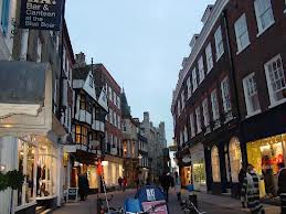


- Botanical gardens
- Mill pond
- Keyside
- Newnham
- City Center Market
- Kings College
- Alleys within the City centre
As all of our locations are outside, we have checked the weather forecast for the day we are filming. As it is a week away, we cannot have an exact forecast. However, we have a rough idea of what the weather will be like.
All of our locations are relatively close to one another and if they are not within walking distance we can easily get a bus as in cambridge they run regularly.
Subscribe to:
Posts (Atom)